Showing posts with label covers. Show all posts

Tuesday, April 21, 2020

EARTH TO DAD’s Cover Three Ways

EARTH TO DAD was my first book to sell in more than one territory, and what added to my delight was that each publisher developed their own unique cover. I thought it would be fun to take a look at these covers and and discuss what each one adds to EARTH TO DAD’s world.


The American cover was the first one to take shape, and I fell instantly in love with Jen Bricking’s interpretation of the two central characters and the overall world. Both Jameson and Astra look exactly as I pictured them, and their environment is harsh but, thanks to the rising sun, ultimately hopeful. (I realize this image could just as easily reflect a setting sun, but I’ve always envisioned it as a sunrise, not a sunset. Now I wonder which Ms. Bricking intended to represent...) I also love the star-swept sky, the saturated color palette, and the striking title treatment. They really make the book stand out.


I wasn’t sure what to expect when I first opened the file that contained the Chinese cover, as EARTH TO DAD was my first book to sell in another territory. Well, suffice it to say I was completely blown away. It was so completely different--and so completely unexpected--but I loved it just as much. The bright reds and oranges are exceptionally eye-catching and definitely create a sense of the red planet's importance. Jameson is super cute, but the focus on his dad also feels appropriate. Interesting side note: because the phrase "Earth to Dad" doesn't translate well into other languages, the Chinese publisher renamed the book MY DAD LIVES ON MARS.


The Korean rights sold on the heels of the simplified Chinese rights, but while the Chinese version was released last year, the South Korean version wasn't slated to come out until sometime this March. (Thanks to the coronavirus, I won't be at all surprised if it hasn't come out yet.) This is the long way of saying the South Korean cover was only finalized a few months ago, so I'm thrilled to share it here. While the American and Chinese covers relied on saturated colors, the South Korean version makes great use of pastels to convey a sense of the story's gentleness. Though the book is set in a post-apocalyptic world, the story is much more about Jameson and Astra's burgeoning friendship and how much they come to care for and look after each other. This cover also does a great job of portraying Base Ripley, where Jameson and Astra live, and you've got to love the South Korean title: HELLO, DAD! THIS IS EARTH.

Well, there you have it, EARTH TO DAD's cover three ways. Which one do you like best? And if you've read the book, which one do you think best represents the story?

Friday, June 29, 2018

A New Title, a Cover Reveal, and a Signed ARC Giveaway

I'm excited to announce Clyde the Second's new title--THE MULTIPLYING MYSTERIES OF MOUNT TEN--and to share the cover reveal, which debuted yesterday on the Pop! Goes the Reader blog. The inimitable Iacopo Bruno perfectly captured the book's tone in this awesome work of art, so definitely go and check it out. And while you're there, don't miss the signed ARC giveaway at the bottom of the post!

Thursday, April 5, 2018

Wednesday, April 4, 2018

Ms. Podos Picks Her Winners

Without any ado, here are Ms. Podos's winners (with her thoughts in orange):

#9 UNDISCOVERED COUNTRY: "The query did a good job of capturing a fantastical plot with multiple surreal elements, which can be so hard to summarize, and the opening page drew me in with its voice, detail, and delicate sorrow."

#10 THE LIBRARY OF UNSPOKEN THINGS: "The query was polished and told me what I needed to know about the character, her arc, and the stakes. Charlotte’s voice shone in the opening scene--she’s a character I want to follow. And I do love an f/f element. :)"

Both UNDISCOVERED COUNTRY and THE LIBRARY OF UNSPOKEN THINGS win requests for the first 3 chapters!

Congratulations, winners! Please e-mail me at kvandolzer(at)gmail(dot)com for details on how to submit your materials.

Lastly but never leastly, thank you to Ms. Podos for taking the time to read and critique these entries, and thank you to YOU for taking the time to do the same. Best of luck with your other queries, and if you have a few spare minutes, do come back tomorrow for the cover reveal of EARTH TO DAD!

Tuesday, March 17, 2015

Interview with an Art Director: John Aardema on DON'T VOTE FOR ME's Cover

I'm so pleased to welcome John Aardema, art director at Sourcebooks, for a much-anticipated interview (or at least I've been anticipating it for the last couple of weeks). When I asked the great folks over at Kidliterati to reveal DON'T VOTE FOR ME's cover, I knew I wanted to offer some bonus content. I immediately thought of interviewing the cover designer, and Mr. Aardema was kind enough to agree. So check out the cover reveal (where I'm giving away THREE SIGNED ARCS), then pop back over here to get the behind-the-scenes scoop!

KV: Tell us a bit about the initial design meeting. Did you have a clear vision for this cover, or did it develop as you went?

JA: This was actually one of the very first covers I worked on when I started at Sourcebooks last summer. The initial meeting was interesting as the very first question we had to address was “what are we going to sell on the cover of this book?” Which is a very important question for an art director to have answers to. In this instance, we had a lot of back and forth around the idea of selling school elections--are kids really interested in that? Would they rather read about the band since both kids play instruments? But when we looked at other books in the middle grade space, and what other books have similar themes, it was clear that kids actually find election stories interesting. The numbers don’t lie. 

The second biggest point of discussion for us was "who should be on the cover?"  This is a story for both boys and girls, and as much as you want every book to sell to both boys and girls, just putting one or the other on the cover doesn’t really represent the content and could limit your audience. So again, we looked at the other titles in the category and what stories that they told. In the end, though, we are telling our story--telling Krista’s story, and telling Veronica and David’s story--and when we had all our questions answered, from there I did my part: sketches that brought to life the elements we all agreed belonged on the cover, the elements that were going to speak to the consumer and tell them what this book was about.

KV: It seems like MG covers tend to be illustrated, but Sourcebooks has had success with MG covers that feature photographs (like the ones in Anna Staniszewski's Dirt Diary series). Why do you think that is, and why did you decide to go with a photographic cover in DON'T VOTE FOR ME's case?

JA: The middle grade space covers a wide age range and reading level. You get second graders who read at fourth and fifth grade levels and want to be challenged, and you get fourth and fifth graders who can’t wait to read what their friends in junior high and even high school are reading. We believe that the cover treatment helps create a visual cue to the reader and to the parent as to how appropriate the content is for kids at various ages in the middle grade space.

You tend to see illustrated covers on what we call “lower middle grade” and then photographic or photo-realistic covers on “upper middle grade.” Stories that may take place in fourth and fifth grade will still have illustrated covers, but once a story or a character hits sixth to eighth or even that wonderful “freshman year,” the covers tend to feel a bit more sophisticated, while the content remains appropriate for younger readers.

And believe it or not, these covers are actually “photo illustrated”--they start with two people being photographed in a studio, but the rest of the design is composited from stock, from illustrations, etc. And the final art is sometimes given a painterly effect. And in this case, the kids on the cover are really only about forty to fifty percent of the total cover experience. The rest is in the illustration, the title type, the layout. The end result is a slightly older, but appropriately aged, middle grade book. 


KV: Once you came up with the initial concept, how did things progress from there?

JA: After the sketch stage, I needed to find the right photo-illustrator, pick clothing for the models, and art direct the illustrator to get the final image we wanted. The expression on the kids' faces was very important. Too much expression in the wrong direction and the girl would look like a bully! And you wanted to believe these kids are in the scene at school even though they are being photographed in a studio. It’s actually a lot more difficult than you’d imagine it to be--getting the right kids with the right expressions to feel like they are in the moment.

Once the photo is taken, then the real work begins. The “illustrator” who creates the full cover layout needs to know how we plan to set the type on the cover so he knows how to position the art. The two have to work together. I worked with the in-house design team--as I mentioned before this was my first cover for Sourcebooks middle grade, so the team here was great in offering suggestions on how to bring the whole package together. I’ve attached a couple of sketches you might find helpful. One is the initial pencil sketch back when we thought we were calling the book RULE THE SCHOOL. The second attachment is a more comprehensive sketch based on a photo test the illustrator sent to me.

KV: I have to admit that I find the whole concept of a photo-illustrated cover fascinating. I'd never heard of this technique, so these last few responses have been especially informative (and it's kind of thrilling to think about real, live kids posing in a real, live photo shoot, but I digress).

My favorite element is definitely the title treatment. Where did that idea come from?

JA: Will Riley, one of the senior designers at Sourcebooks, does a phenomenal job with middle grade and has a great eye for type. He really helped build this cover from the raw images into the final package, and that type had a lot to do with the final direction ending up where it did.

KV: Talk to us about the color palette. The patriotic reds, whites, and blues are especially appropriate for this story. Was that intentional?

JA: Again, as we discussed how to position the cover, and the focus on elections, it only seemed natural to go with a red, white, and blue color palette. Any kid running for school election is probably going to paint his or her own campaign posters in red, white, and blue--most politicians do too! It’s a natural choice and helps really keep the focus on the package as a whole. 

KV: Last but certainly not least, I'm handing the mike over to you. Any final thoughts about DON'T VOTE FOR ME or its cover?

JA: I’m glad you liked the cover for DON'T VOTE FOR ME. It was a great first project for me at Sourcebooks. It was definitely a team effort on our part, and a number of departments all had a hand in making sure the cover we ultimately put on the book is the very best we could put forth in terms of design, marketing potential, and quality. Best of luck on your cover reveal!

Thank you, Mr. Aardema! And thank you for these insightful responses. The more I learn about this industry, the more I realize I don't know much, so I appreciate your taking the time to fill us in on this part of the process.

Thursday, October 2, 2014

THE SOUND OF LIFE AND EVERYTHING's Cover

What's THE SOUND OF LIFE AND EVERYTHING? Steve's official title! And since I'm sure you hate scrolling as much as I do, let's just cut to the chase:


Hats off to Rose Wong, whose amazing artwork will stretch end-to-end on the final jacket (which I've included at the bottom of this post). She did a great job of capturing the story's essence. And hats off to Shauna for the awesome new title, but then, we're not surprised I couldn't come up with one, are we? :)

I'm sure I'll host an ARC giveaway--or two or three--at some point in the future, but if you've ever wanted to say thank you for anything you've found on the blog, a great way to do it would be to pre-order Steve and/or add him on Goodreads. It feels weird to type that, so I'm going to leave it right there, but just in case you are interested, here are the sales links:


*whistles, walks away*

It's been a while since I've blogged about Steve, so if you have any questions about where he's at (or where he's been), feel free to lay them on me!


Wednesday, October 1, 2014

The Blog's Birthday Giveaway Winners

First off, I just want to say THANK YOU for all your comments and well wishes. I genuinely enjoy blogging, so it feels like more of a hobby than an accomplishment, but I'm glad that you've gotten something out of the blog, too.

As for the giveaways, some of you asked questions that I neglected to answer (smacks forehead), so rest assured that if you said you wanted to be entered in either or both of the giveaways, I entered you. And you could have won both, so I didn't prioritize one over the other. Everyone had an equal chance of winning either or both of the giveaways they entered.

First up, the book winners!

Inspired Mom
Rosalyn
Julie DeGuia

Please e-mail me at kvandolzer(at)gmail(dot)com with your mailing addresses and which of the four books you want. (And just so you don't have to click back to that old post, you can choose between a hardcover pre-order of A.L. Sonnichsen's RED BUTTERFLY, a paperback of Liesl Shurtliff's RUMP, a hardcover pre-order of Liesl Shurtliff's JACK (a companion novel to RUMP that stands alone), or a hardcover of Tara Dairman's ALL FOUR STARS.)

And here are the critique winners!

Jessica Silva
Sherry Howard
Maria

Feel free to send the first 30 pages of your manuscripts as attachments to kvandolzer(at)gmail(dot)com. I want you to send full chapters, so you're welcome to send up to 35 pages if that will get you to a chapter break. (On the other hand, if you have to choose between 28 pages and 36 pages, please send 28 pages.) Can't wait to read your work!

Finally, please come back tomorrow if you have a few minutes. I plan to reveal Steve's cover right here tomorrow morning!

Friday, June 6, 2014

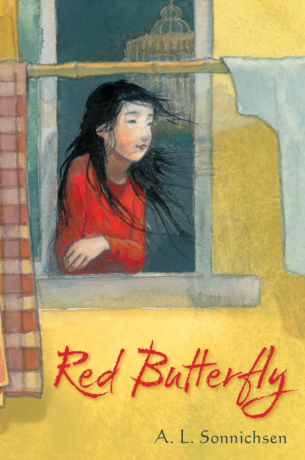
An Interview, an ARC Giveaway, and a Cover Reveal: RED BUTTERFLY by A.L. Sonnichsen

I'm thrilled to welcome Laurent Linn, art director at Simon & Schuster Books for Young Readers, to the blog for a very special interview. Longtime readers probably know that I've been friends with A.L. Sonnichsen for almost four and a half years (though I usually call her Amy), so I've had a front-row seat for RED BUTTERFLY's metamorphosis. Now that Amy's made it to her first cover reveal, I thought it would be cool to hear a bit from the designer.

(I'm also giving away one of Amy's ARCs, so after you check out the interview, definitely check out the giveaway at the bottom of this post!)

KV: In our initial e-mail exchange, you mentioned that RED BUTTERFLY was a special project for you. What do you love about it?

LL: When a manuscript comes to me to read for pondering the cover and interior designs, I only have time to read them outside of the office. I read RED BUTTERFLY on a plane trip and the poor people around me must have wondered what was wrong with me. I was crying an laughing and gasping...the story and characters really impacted me. It was clearly a rare work and I've never read anything like it. Filled with the hopes and heartaches of growing up, finding where you truly belong, and who to trust. I was so solidly in the main character's shoes that I felt every emotion with her, and saw our own American culture through her eyes, which was truly enlightening. So I wanted to be sure it had a special and striking design, to do justice to the story and writing. To really stand out.

KV: Tell us a bit about that initial design meeting. Did you have a clear vision for this cover, or did it develop as you went?

LL: Because it's prose written in a poetic form, I immediately wanted the cover to be lyrical and hint at the poetic feel of the text. But I also knew we had to show Kara, the main character, since it truly is such a personal story. And hinting at the unique Chinese elements of the story were important. Being a middle-grade book, I wanted it to also appeal to all readers, too, so not look too sophisticated or inaccessible to readers of all types of genres. A tricky task! So, while there were clear directions I wanted to include in the cover imagery and design, it did develop as I explored ideas. But the key was finding the perfect illustrator do collaborate with.

KV: It seems like YA covers typically make use of photographs while their MG counterparts are more often illustrated. Why is that, and why did you decide to go with an illustrated cover in RED BUTTERFLY's case?

LL: Why YA often uses photography and middle-grade illustration is a hard subject to cover in a few sentences(!) But there was never a question that this book should be anything other than illustrated. The lyricism of the text and the subtle emotions and discoveries in the story could be conveyed best in art. I wanted the cover to have textures and depth. Also, I did want to show Kara, but in a way that suggests what she looks like rather than show a specific person, as a photo would do. So, while an illustration of her face does give us a specific image of her, if done in a loose illustrated style it could leave more to the reader's imagination to visualize her as they see her.

KV: Sounds like I need to have you back sometime to give us the inside scoop on YA versus MG covers! But that's beside the point...

Who did the cover art, and why did you pick him or her?

LL: With special books, I love giving an illustrator freedom to imagine concepts first without any art direction. They get the manuscript, read it, and are free to come up with ideas of their own first. When possible, I don't like to "handcuff" illustrators by giving them specific art directions right away. It can get in the way of creativity. I want to hire a great artist for their unique vision and inspiration. So I knew it had to be someone who could do that as well as have the appropriate style. And I knew right away who that would be: Amy June Bates.

Amy is an extremely talented artist, but also a storyteller in her art and concepts. She brings subtle emotions and power to her art. Also, while she's American, she's lived in Japan so has a passion, respect, and understanding of Asian art and techniques. I wanted to hint at Chinese calligraphy textures on the cover, (which Amy did so beautifully in Kara's hair). As soon as she read the manuscript, Amy called me filled with emotion and excitement about the book--she was affected as much as I was by the story and writing. This book has become a passion for her as well!

KV: Once you got the initial sketches back, how did things progress from there?

LL: Amy drew a few wonderful concepts, but the one that stood out was what did eventually become the jacket art. Kara in the window, looking out at the world. Her face and pose and the environment changed as we went, but the main imagery stayed the same. Amy got it right away!

We did try the idea of having a subtle pattern of Chinese words and symbols on the outside wall (to show more about her outer world) and a pattern of text from Pride and Prejudice (which figures into Kara's story) on the inside wall. But it muddled the image and took away from focusing on Kara. After refining the sketch, Amy created her painting and I designed the title type. I wanted the lettering to reflect the Chinese brushwork I mentioned, and have movement and a lyrical quality.

KV: Talk to us about the color palette. The striking reds and yellows are especially appropriate for this story. Was that intentional?

LL: Yes, it was. In the book there is powerful symbolism with a red butterfly so we knew we wanted to have the type in red and Kara wearing red, so it's visually clear she is the red butterfly. And, in a practical way, I also wanted it to be clear the book isn't actually about a red butterfly. We initially thought of perhaps showing a butterfly flying or resting on the bamboo pole, but realized that could be deceiving. And the yellow, as you say, is appropriate to the story, but is also accurate to what a Chinese apartment building could look like in reality. And those golds and yellows are the perfect colors to surround Kara to be sure she is the focus and also set off the title nicely.

KV: Last but certainly not least, I'm handing the mike over to you. Any final thoughts about RED BUTTERFLY or its cover?

LL: To me, much of the power of the cover comes from the fact that we, the reader, and Kara are both looking through a window. We're about to look in and see her world, just as she's looking out into ours. Also, the dark interior, with the wonderfully symbolic birdcage (which is in the text) tell us so much about her inner world and emotions. While the outside world is bright and the wind in her hair hints at motion and energy.

And I want to share something quite remarkable. Initially there weren't any plans for interior art, just the cover. But when I read it I envisioned spare, small art spots here and there to enrich the book as a whole and complement the text. All agreed so I asked Amy if she would also create some small black and white pieces for the interior, about thirty illustrations in all. Well, Amy got so swept away and inspired that she created over seventy of them! And not only that, she created her own newsprint of Chinese characters, each word meaning some aspect of the book. She then used this newsprint to create collages, along with text pages from Pride and Prejudice, and inked the art on the collages using a Chinese brush line and style. They are glorious. And you'll just have to get the book to see for yourself!

I will see for myself as soon as Amy's book comes out! You can bet I'll be one of the first to buy RED BUTTERFLY come February. But YOU don't have to wait, since Amy has graciously offered to send an ARC to one random winner. To enter, just tell me in the comments that you'd like to win. Contest is open to US and Canadian residents and closes in two weeks, on Thursday, June 19, at 11:59 p.m. EDT (or 8:59 p.m. PDT). I'll select the winner the next day.

Oh, and perhaps you'd like to see the cover? :) Here it is!

Monday, September 30, 2013

It's Cover Reveal Day for Tara Dairman and ALL FOUR STARS!

Two years ago, I hosted one of the first rounds of "An Agent's Inbox," and a writer I'd never heard of happened to enter. She was querying a manuscript about an eleven-year-old foodie who inadvertently lands a job as a freelance food critic with a major newspaper. I fell in love with the character--in the very first page, Gladys manages to set her parents' curtains on fire when her creme brulee goes awry--and immediately started stalking following the writer around the Internet. I was thrilled but not at all surprised when Ammi-Joan Paquette of Erin Murphy Literary Agency signed her, then sold her manuscript a few months later.

And now it's time to reveal the cover.

The writer, of course, is my good friend Tara, and the manuscript in question is ALL FOUR STARS. The official reveal is over on the Emu's Debuts blog, but Tara was kind enough to answer a few of my questions. So check out the cover, then hop back over here to check out Tara's answers. (Or check out Tara's answers, then hop over to Emu's Debuts to check out the cover. I'm not picky:) )

KV: What do you love about your cover?

TD: Well, the easy answer would be "everything"--the artist (the fabulous Kelly Murphyand the Penguin design team did such a great job working important details from the story (the food, the New York setting, the writing element)!

But if I had to choose one favorite thing, I'd pick Gladys herself, hands down. She really looks exactly the way I've been picturing her for years--it's like Kelly just crawled right into my brain to draw her. :) And with Gladys's seated stance and her book, I feel like she also kind of recalls Quentin Blake's illustration of Matilda. (I might just be projecting that connection, though, since Matilda was my favorite book as a kid.)

KV: Did your publisher consult with you about the cover's design?

TD: Yes--my editor asked me to share some other covers I really liked, so I put together a little PowerPoint file with five or six examples. (I also shared a few on my blog here: http://taradairman.com/2013/04/03/cover-ideas-book-2-obsessions-and-more/) Several of them had city skylines in them...and hey, look, now my cover does, too! So I guess that worked. :)

KV: Putnam offered on your manuscript back in the spring of 2012, and now it's fall of 2013, less than a year until the book's release. What journey has your story taken in the intervening months?

TD: Well, it's been through two big rounds of edits, plus line edits, copyedits, and first pass pages; and it's gotten a title, a cover, and a blurb from the incredible Jennifer A. Nielsen (this still blows my mind). But through all of that, the story itself hasn't changed all that much. It's gotten a bit longer, and is much better-written now thanks to the promptings of our uber-talented editor, Shauna Rossano. 

KV: We're in good hands, aren't we, Tara? :) But I digress...

What still has to happen before the book comes out?

TD: Well, soon there will be bound galleys (also known as ARCs, or Advance Reading Copies), which I guess means that reviewers and kidlit bloggers and other people who are not related to me will finally get to read Gladys's story. I find this both terribly exciting and a bit nerve-wracking. I'm definitely eager for the book to find its way into kids' hands when it's finally published next summer. 

KV: Last but not least, Putnam recently bought a sequel to ALL FOUR STARS. (Woohoo!) Any juicy tidbits you can share with us? :)

TD: I'm so thrilled that there's going to be a sequel! I've had it in my head for a long time, and recently finished writing the first draft. I don't want to give away too much, since no one's read the first book yet, but I'll just say that Gladys's culinary adventures will continue at summer camp, where she takes on some new kitchen challenges and encounters some new nemeses. It should come out in the summer of 2015.  

Thanks for having me, Krista!

And thanks for stopping by, Tara. Can't wait for 2014!

Tuesday, March 12, 2013

Cover Reveal! DEMON DERBY by Carrie Harris


This is my first cover reveal, but when Carrie Harris tweeted about the opportunity to be a part of the blog tour (hosted by AToMR Tours), I jumped at the chance. I've been a fan of Ms. Harris's work since BAD TASTE IN BOYS debuted (in fact, I even wrote a review for it way back when), and her upcoming release, DEMON DERBY (Random House 2014), sounds just as engaging. Here's the pitch (and the cover!):

Casey kicked cancer’s ass. Now a demon wants to kick hers...

Casey hates being known as the girl who survived cancer. She wants people to treat her like her old self, fearless and strong. And after a creepy encounter with a crazy guy in an alley, Casey is all about reclaiming her power.

So when she has a chance to try out for the Apocalypsies roller derby team, she jumps on it. Being a derby girl would prove that she doesn’t need anybody’s pity. It doesn’t hurt that Michael, the team manager, is almost unnaturally hot. Which makes sense when Casey finds out that he’s not even human.

Michael’s got a secret: he trains demon hunters. That crazy guy in the alley? Demon. And the fact that Casey went head to head with evil and lived makes her a threat to demonkind. Casey thought she’d already fought and won the battle of her lifetime. But it’s only beginning...

Ms. Harris has an uncanny knack for combining humor, blood, and guts (in the best possible way), and DEMON DERBY promises to be no different. But I have a feeling DEMON DERBY will top both of her previous books. I remember reading a post a while back about the inspiration for the book (when I find it again, I'll add a link), so I know the subject matter hits especially close to home. When you write from your heart, it shows on the page.

Don't forget to add DEMON DERBY to your Goodreads list, and don't miss Ms. Harris's blog and Twitter feed! I promise she is just as funny in real life on the Internet as the characters are in her books. (I had to scratch that out when I realized I don't actually know Ms. Harris in real life, because after following her on Twitter for the last year, I feel like I do:) )

Thanks again, AToMR Tours, for putting together this blog tour (and for letting me be a part of it!

Tuesday, July 24, 2012

Cover Reveal! RUMP by Liesl Shurtliff

Just popping in to redirect you to Liesl Shurtliff's blog so you can check out the cover reveal for her MG debut RUMP (Knopf/Random House 2013). I'd post the cover myself, but then you might not check out her post, and you need to check out her post, because she's giving away an ARC. An ARC of the very first book one of my critique partners has published! It's the next best thing to seeing an ARC of my own:)

I'll be giving an ARC away as well sometime within the next few weeks, so if you don't win Liesl's copy, make sure you come back here for a chance to win mine. Until then, enjoy the view over at Liesl's blog! Her cover artist, the uber-talented Zdenko Basic, really hit a home run with this one...