I have crazy eyes. I don't know the name of my condition, but suffice it to say that I got glasses when I was three and contacts when I was thirteen, but I haven't worn corrective lenses since the summer after I turned fourteen. My vision had improved--which is to say that my brain had learned how to discard all the input it got from my bad eye--and though my mom didn't believe me, the ophthalmologist confirmed it.
But there was a catch: according to the ophthalmologist, my vision would go bad again, probably when I got pregnant. Except it hasn't happened. Three kids and sixteen years later, I'm still waiting for my vision to deteriorate. But even though it's hanging in there, it isn't what it used to be. My eyes are always tired, even right after I wake up, and there are some days when the only thing that brings relief is putting on a mask and taking a rest on the couch. My vision is as clear as it's been in the past, but my eyes feel like they're working ten times harder to stay focused. They're exhausted. I'm exhausted. We all wish they'd just fail so I can wear contacts again.
Lately, though, I've wondered if something more is going on. I have a tendency to jump to the worst-case scenario--I think most writers do; that's one of the things that make us writers--so I've convinced myself I'm going blind. And a really weird thing happened: I convinced myself I'd be okay. No, I convinced myself I'd thrive.
Now, it isn't that I think being blind would be easy. The truth is, being blind must be incredibly hard. Like, so hard I can't imagine it. So hard I can't appreciate how much easier it is to be a person who sees. But there's something about running into a giant obstacle that brings out the best in people. When the going gets tough, most people really do get going (and I think--I hope--I'd do the same).
But then a small voice whispered, "If you'd be okay with going BLIND, why can't you be okay with this? Aren't tired eyes way better than eyes that don't see at all?"
It's been almost a year since Steve and Clyde sold, give or take, and what I've learned along the way, from my experience and others', is that little disappointments will always be part of this journey. Editors switch jobs. Books get reassigned. Covers get dumped. Release dates get pushed back. I'll admit that I've let these things get to me more than I probably should have, especially since they're NOTHING compared to the cancellation of a contract or the closing of an imprint.
One of my favorite Bible stories is the story of Naaman. He's some kind of hotshot in the Syrian army, but his wife's handmaiden is a young Israelite girl. When Naaman contracts leprosy, this handmaiden tells her mistress that there's a prophet in Israel who has the power to heal her husband. Naaman pulls a caravan together and marches down to Elisha's house, intent on finding a cure. But when they get there, Elisha doesn't even bother to come out and say hello. He sends his servant boy instead, and what the servant boy tells him is so simple it's preposterous: wash in the Jordan River seven times, and his leprosy will go away.
Naaman is incensed. He's a Syrian hotshot, for Pete's sake, and yet Elisha can't be bothered to deliver these orders himself? Also, the Jordan River is a trickle. There are way better rivers back in Syria. He came all this way for THIS?
But his counselor is more reasonable. He points out that if the prophet had told him to do some great thing--hike to the top of Mount Caramba, retrieve a feather from a phoenix, and use it to fly home--he would have done it in a heartbeat. So why shouldn't he do this very small and simple thing?
I don't know why some of us have to hike to the top of Mount Caramba while others are told to wash in a river seven times. But if we're willing to climb a mountain, we should probably be willing to take a dip in that gross river. It's rarely as bad as it seems.


Thursday, June 26, 2014
Tuesday, June 24, 2014
New Look Courtesy of Icey Designs
The blog has a new look courtesy of Icey Designs! It took us a few tries to get to this design, but I love how it turned out. I told Hafsah I wanted something in neutral tones with pops of color, and that's precisely what she gave me. The old-fashioned typewriter was the perfect touch.
You'll notice that I've taken down some of the preexisting pages. I know that makes it harder to find interviews and past rounds of "An Agent's Inbox," so I'm trying to figure out how to include those references without cluttering things up. (In other words, stay tuned!)
In the meantime, I hope you'll stick around. The next few months should include a few cover reveals and more details about Steve and Clyde's respective releases. (In case you haven't noticed, Steve and Clyde will now be coming out in the same season, Summer 2015.) Exciting times!
Friday, June 20, 2014
Winner of RED BUTTERFLY!
Random.org has spoken, and the winner of RED BUTTERFLY is Leandra Wallace!
Congratulations, Leandra! Please e-mail me at kvandolzer(at)gmail(dot)com with your mailing address so I can pass it on to Amy.
Congratulations, Leandra! Please e-mail me at kvandolzer(at)gmail(dot)com with your mailing address so I can pass it on to Amy.
Monday, June 16, 2014
Make It Personal
I should preface this by saying that I don't write thrillers. Every time I try, someone shoots me down, so there’s a possibility that I don’t know what I’m talking about. But even though I don’t produce them, I do like to consume them, and I’ve had a few thoughts that I wanted to share.
I finally saw Jack Ryan: Shadow Recruit over the weekend, and while I liked it on the whole, I thought it suffered from the same problem that Mission: Impossible – Ghost Protocol did:
The climax was less interesting than the sequence that led up to it.
In Jack Ryan, I loved the Moscow sequence, but the climax in New York barely held my interest. And in Mission: Impossible, I loved the Dubai sequence, but the climax in Mumbai fell flat for me. Now, at first blush, that seems counterintuitive. Jack Ryan was trying to thwart a terrorist attack that would have killed thousands of people and obliterated the dollar’s value (which would have ended up killing tens of thousands more). Similarly, Ethan Hunt was trying to prevent nuclear war. The stakes should have been huge.
But it turns out that body counts matter a lot less to me--and probably to other consumers--than deeply personal stakes. The world wouldn’t have blown up if things hadn’t worked out in Moscow or Dubai, but Jack Ryan would have lost his fiancée, and Ethan Hunt would have collapsed the whole Mission: Impossible mythology. (Don’t mess up the masks, Ethan. You can mess up everything else, but you can’t mess up those.) I cared about Cathy in a way I didn’t care about those New York extras (though that may have been because I’d never heard Keira Knightley do an American accent before, but still). When the story hits the fan, I care about CHARACTERS and the things they care about.
So if you don’t want an interior sequence to outshine your climax, I have one piece of advice: make it personal.
Tuesday, June 10, 2014
"My Writing Process" Blog Tour
By now, I'm sure most of you have heard about the ongoing "My Writing Process" blog tour, which has been making the rounds. The girls over at The Write Shelf were kind enough to tag me, so here are my answers to the now-familiar questions:
What am I working on?
I'm kind of bouncing back and forth between Steve and Clyde at the moment, but since Clyde's latest draft is currently open on my desktop, let's go with him for now:)
How does my work differ from others of its genre?
Clyde's a quirky MG contemporary, so he's got a lot of company. I'd say the most unique thing about him is that he's a retelling of a biblical story. I suppose any underdog story could be considered a retelling of David and Goliath, but I really tried to incorporate some of the plot points from 1 Samuel into Clyde's storyline.
Why do I write what I do?
I tried speculative YA stuff, both fantasy and sci-fi, for the first few years, didn't have a ton of success, switched over to realistic MG (sort of), and had lightning strike. I landed an agent and two book deals within a year and a half, so I'm a huge proponent of trying something new if what you've been writing for a while isn't getting you where you want to be.
How does your writing process work?
I started out as a pantser, made the leap to plotter, and ultimately went back to pantser. If I spend too much time not-writing, the whole thing starts to feel like homework, so I let myself just go, go, go when I'm writing a first draft. But once I've raced through that first draft, I spend a ton of time revising (like, two or three times as long as I spent writing the first draft, and that's BEFORE I start working with an editor). In other words, most of the work gets done on the back end for me.
Next up, Myrna Foster and A.L. Sonnichsen! These two have been good writing friends for almost as long as I've been blogging, and I can honestly say I wouldn't be where I am without them. Definitely check out their blogs (and keep an eye out for their posts next week!).
Friday, June 6, 2014
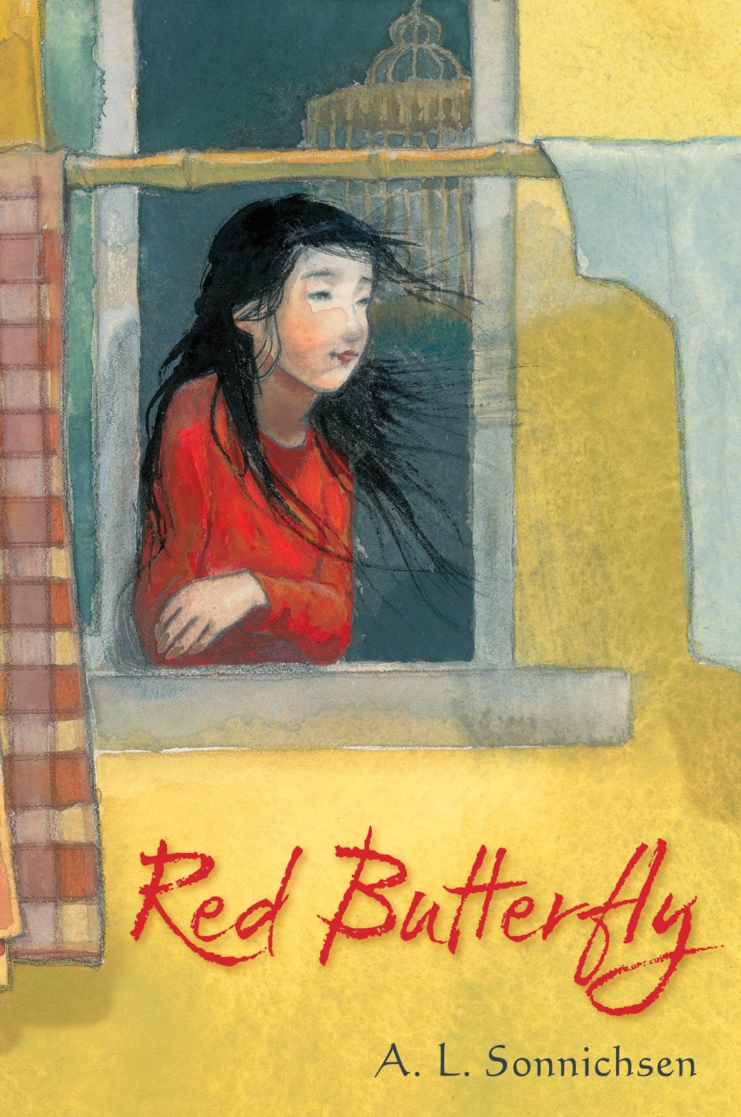
An Interview, an ARC Giveaway, and a Cover Reveal: RED BUTTERFLY by A.L. Sonnichsen
I'm thrilled to welcome Laurent Linn, art director at Simon & Schuster Books for Young Readers, to the blog for a very special interview. Longtime readers probably know that I've been friends with A.L. Sonnichsen for almost four and a half years (though I usually call her Amy), so I've had a front-row seat for RED BUTTERFLY's metamorphosis. Now that Amy's made it to her first cover reveal, I thought it would be cool to hear a bit from the designer.
(I'm also giving away one of Amy's ARCs, so after you check out the interview, definitely check out the giveaway at the bottom of this post!)
KV: In our initial e-mail exchange, you mentioned that RED BUTTERFLY was a special project for you. What do you love about it?
LL: When a manuscript comes to me to read for pondering the cover and interior designs, I only have time to read them outside of the office. I read RED BUTTERFLY on a plane trip and the poor people around me must have wondered what was wrong with me. I was crying an laughing and gasping...the story and characters really impacted me. It was clearly a rare work and I've never read anything like it. Filled with the hopes and heartaches of growing up, finding where you truly belong, and who to trust. I was so solidly in the main character's shoes that I felt every emotion with her, and saw our own American culture through her eyes, which was truly enlightening. So I wanted to be sure it had a special and striking design, to do justice to the story and writing. To really stand out.
KV: Tell us a bit about that initial design meeting. Did you have a clear vision for this cover, or did it develop as you went?
LL: Why YA often uses photography and middle-grade illustration is a hard subject to cover in a few sentences(!) But there was never a question that this book should be anything other than illustrated. The lyricism of the text and the subtle emotions and discoveries in the story could be conveyed best in art. I wanted the cover to have textures and depth. Also, I did want to show Kara, but in a way that suggests what she looks like rather than show a specific person, as a photo would do. So, while an illustration of her face does give us a specific image of her, if done in a loose illustrated style it could leave more to the reader's imagination to visualize her as they see her.
KV: Sounds like I need to have you back sometime to give us the inside scoop on YA versus MG covers! But that's beside the point...
Who did the cover art, and why did you pick him or her?
LL: With special books, I love giving an illustrator freedom to imagine concepts first without any art direction. They get the manuscript, read it, and are free to come up with ideas of their own first. When possible, I don't like to "handcuff" illustrators by giving them specific art directions right away. It can get in the way of creativity. I want to hire a great artist for their unique vision and inspiration. So I knew it had to be someone who could do that as well as have the appropriate style. And I knew right away who that would be: Amy June Bates.
LL: Amy drew a few wonderful concepts, but the one that stood out was what did eventually become the jacket art. Kara in the window, looking out at the world. Her face and pose and the environment changed as we went, but the main imagery stayed the same. Amy got it right away!
LL: Yes, it was. In the book there is powerful symbolism with a red butterfly so we knew we wanted to have the type in red and Kara wearing red, so it's visually clear she is the red butterfly. And, in a practical way, I also wanted it to be clear the book isn't actually about a red butterfly. We initially thought of perhaps showing a butterfly flying or resting on the bamboo pole, but realized that could be deceiving. And the yellow, as you say, is appropriate to the story, but is also accurate to what a Chinese apartment building could look like in reality. And those golds and yellows are the perfect colors to surround Kara to be sure she is the focus and also set off the title nicely.
KV: Last but certainly not least, I'm handing the mike over to you. Any final thoughts about RED BUTTERFLY or its cover?
LL: To me, much of the power of the cover comes from the fact that we, the reader, and Kara are both looking through a window. We're about to look in and see her world, just as she's looking out into ours. Also, the dark interior, with the wonderfully symbolic birdcage (which is in the text) tell us so much about her inner world and emotions. While the outside world is bright and the wind in her hair hints at motion and energy.
And I want to share something quite remarkable. Initially there weren't any plans for interior art, just the cover. But when I read it I envisioned spare, small art spots here and there to enrich the book as a whole and complement the text. All agreed so I asked Amy if she would also create some small black and white pieces for the interior, about thirty illustrations in all. Well, Amy got so swept away and inspired that she created over seventy of them! And not only that, she created her own newsprint of Chinese characters, each word meaning some aspect of the book. She then used this newsprint to create collages, along with text pages from Pride and Prejudice, and inked the art on the collages using a Chinese brush line and style. They are glorious. And you'll just have to get the book to see for yourself!
(I'm also giving away one of Amy's ARCs, so after you check out the interview, definitely check out the giveaway at the bottom of this post!)
KV: In our initial e-mail exchange, you mentioned that RED BUTTERFLY was a special project for you. What do you love about it?
LL: When a manuscript comes to me to read for pondering the cover and interior designs, I only have time to read them outside of the office. I read RED BUTTERFLY on a plane trip and the poor people around me must have wondered what was wrong with me. I was crying an laughing and gasping...the story and characters really impacted me. It was clearly a rare work and I've never read anything like it. Filled with the hopes and heartaches of growing up, finding where you truly belong, and who to trust. I was so solidly in the main character's shoes that I felt every emotion with her, and saw our own American culture through her eyes, which was truly enlightening. So I wanted to be sure it had a special and striking design, to do justice to the story and writing. To really stand out.
KV: Tell us a bit about that initial design meeting. Did you have a clear vision for this cover, or did it develop as you went?
LL: Because it's prose written in a poetic form, I immediately wanted the cover to be lyrical and hint at the poetic feel of the text. But I also knew we had to show Kara, the main character, since it truly is such a personal story. And hinting at the unique Chinese elements of the story were important. Being a middle-grade book, I wanted it to also appeal to all readers, too, so not look too sophisticated or inaccessible to readers of all types of genres. A tricky task! So, while there were clear directions I wanted to include in the cover imagery and design, it did develop as I explored ideas. But the key was finding the perfect illustrator do collaborate with.
KV: It seems like YA covers typically make use of photographs while their MG counterparts are more often illustrated. Why is that, and why did you decide to go with an illustrated cover in RED BUTTERFLY's case?
LL: Why YA often uses photography and middle-grade illustration is a hard subject to cover in a few sentences(!) But there was never a question that this book should be anything other than illustrated. The lyricism of the text and the subtle emotions and discoveries in the story could be conveyed best in art. I wanted the cover to have textures and depth. Also, I did want to show Kara, but in a way that suggests what she looks like rather than show a specific person, as a photo would do. So, while an illustration of her face does give us a specific image of her, if done in a loose illustrated style it could leave more to the reader's imagination to visualize her as they see her.
KV: Sounds like I need to have you back sometime to give us the inside scoop on YA versus MG covers! But that's beside the point...
Who did the cover art, and why did you pick him or her?
LL: With special books, I love giving an illustrator freedom to imagine concepts first without any art direction. They get the manuscript, read it, and are free to come up with ideas of their own first. When possible, I don't like to "handcuff" illustrators by giving them specific art directions right away. It can get in the way of creativity. I want to hire a great artist for their unique vision and inspiration. So I knew it had to be someone who could do that as well as have the appropriate style. And I knew right away who that would be: Amy June Bates.
Amy is an extremely talented artist, but also a storyteller in her art and concepts. She brings subtle emotions and power to her art. Also, while she's American, she's lived in Japan so has a passion, respect, and understanding of Asian art and techniques. I wanted to hint at Chinese calligraphy textures on the cover, (which Amy did so beautifully in Kara's hair). As soon as she read the manuscript, Amy called me filled with emotion and excitement about the book--she was affected as much as I was by the story and writing. This book has become a passion for her as well!
KV: Once you got the initial sketches back, how did things progress from there?
KV: Once you got the initial sketches back, how did things progress from there?
LL: Amy drew a few wonderful concepts, but the one that stood out was what did eventually become the jacket art. Kara in the window, looking out at the world. Her face and pose and the environment changed as we went, but the main imagery stayed the same. Amy got it right away!
We did try the idea of having a subtle pattern of Chinese words and symbols on the outside wall (to show more about her outer world) and a pattern of text from Pride and Prejudice (which figures into Kara's story) on the inside wall. But it muddled the image and took away from focusing on Kara. After refining the sketch, Amy created her painting and I designed the title type. I wanted the lettering to reflect the Chinese brushwork I mentioned, and have movement and a lyrical quality.
KV: Talk to us about the color palette. The striking reds and yellows are especially appropriate for this story. Was that intentional?
KV: Talk to us about the color palette. The striking reds and yellows are especially appropriate for this story. Was that intentional?
LL: Yes, it was. In the book there is powerful symbolism with a red butterfly so we knew we wanted to have the type in red and Kara wearing red, so it's visually clear she is the red butterfly. And, in a practical way, I also wanted it to be clear the book isn't actually about a red butterfly. We initially thought of perhaps showing a butterfly flying or resting on the bamboo pole, but realized that could be deceiving. And the yellow, as you say, is appropriate to the story, but is also accurate to what a Chinese apartment building could look like in reality. And those golds and yellows are the perfect colors to surround Kara to be sure she is the focus and also set off the title nicely.
KV: Last but certainly not least, I'm handing the mike over to you. Any final thoughts about RED BUTTERFLY or its cover?
LL: To me, much of the power of the cover comes from the fact that we, the reader, and Kara are both looking through a window. We're about to look in and see her world, just as she's looking out into ours. Also, the dark interior, with the wonderfully symbolic birdcage (which is in the text) tell us so much about her inner world and emotions. While the outside world is bright and the wind in her hair hints at motion and energy.
And I want to share something quite remarkable. Initially there weren't any plans for interior art, just the cover. But when I read it I envisioned spare, small art spots here and there to enrich the book as a whole and complement the text. All agreed so I asked Amy if she would also create some small black and white pieces for the interior, about thirty illustrations in all. Well, Amy got so swept away and inspired that she created over seventy of them! And not only that, she created her own newsprint of Chinese characters, each word meaning some aspect of the book. She then used this newsprint to create collages, along with text pages from Pride and Prejudice, and inked the art on the collages using a Chinese brush line and style. They are glorious. And you'll just have to get the book to see for yourself!
I will see for myself as soon as Amy's book comes out! You can bet I'll be one of the first to buy RED BUTTERFLY come February. But YOU don't have to wait, since Amy has graciously offered to send an ARC to one random winner. To enter, just tell me in the comments that you'd like to win. Contest is open to US and Canadian residents and closes in two weeks, on Thursday, June 19, at 11:59 p.m. EDT (or 8:59 p.m. PDT). I'll select the winner the next day.
Oh, and perhaps you'd like to see the cover? :) Here it is!
Subscribe to:
Posts (Atom)
